> For the complete documentation index, see [llms.txt](https://docs.abtasty.com/llms.txt). Markdown versions of documentation pages are available by appending `.md` to page URLs; this page is available as [Markdown](https://docs.abtasty.com/web-experimentation-and-personalization/editors-and-widget/list-of-widgets/ab-tasty-prebuilt-widgets/drawer-widget.md).
# Drawer Widget
The Drawer widget is part of the **Promotional Content** widget category. For more information on the widgets, please refer to [Widgets configuration in the visual editor](/web-experimentation-and-personalization/editors-and-widget/list-of-widgets/widgets-configuration-in-the-visual-editor.md).
## Introduction
The Drawer widget allows you to incorporate a dynamic element into your variations. The drawer appears as a tab (referred to as the "Sticky Button") affixed to one edge of the screen, presenting a headline (and optionally an icon) to invite visitors to click on it. If clicked, a panel will unfold from the edge of the screen to present content to the visitor.
Similar to other widgets offered by the platform, extensive configuration options enable you to define what you want to present to your visitors within this experience.
## Configuration
### Layout tab
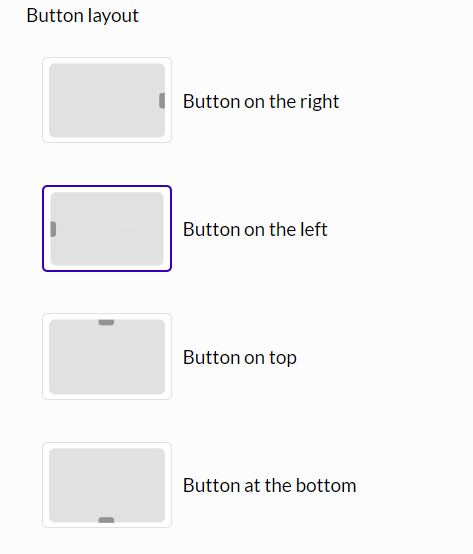
In addition to the typical sizing and layer definition configurations, the layout section allows you to define two positions for the widget. The "Button layout" section describes the positioning of the drawer tab precisely on the site, and consequently, the direction in which the drawer will unfold upon clicking (a tab on the left implies the drawer unfolds to the right, a tab at the top implies a downward unfolding, and so on).
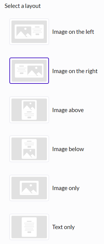
 The "Layout" section more conventionally describes the organization of elements presented within the content itself.
The content section provides options to present text elements as well as an image. It is worth noting, however, that the drawer offers the option to work with "Text only" or "Image only" content if the experience requires it.
The "Layout" section more conventionally describes the organization of elements presented within the content itself.
The content section provides options to present text elements as well as an image. It is worth noting, however, that the drawer offers the option to work with "Text only" or "Image only" content if the experience requires it.
 ### Content tab
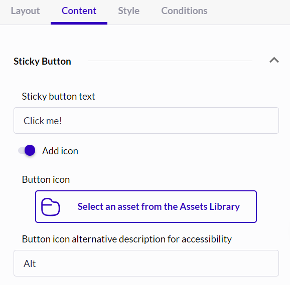
The content configuration also allows you to define the content of both the tab (Sticky Button) and the drawer itself.
For the Sticky Button, the configuration involves defining the text displayed to the user and optionally an icon if desired.
### Content tab
The content configuration also allows you to define the content of both the tab (Sticky Button) and the drawer itself.
For the Sticky Button, the configuration involves defining the text displayed to the user and optionally an icon if desired.
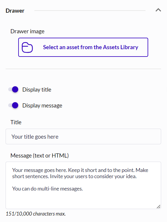
 For the drawer part, the content configuration is relatively similar to that of an Image Popin. You can define the elements you want to display to your visitors and configure them. Thus, it is possible to choose whether the drawer will present a title and text. You can also configure the content of these elements and the image to be displayed.
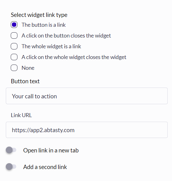
 Finally, still in the content section, it is possible to configure the button or buttons offered to visitors as well as their behavior (closing the widget, redirection, etc.).
 ### Style tab
Similarly, the style configuration allows adaptation for both the Sticky Button and the drawer itself.
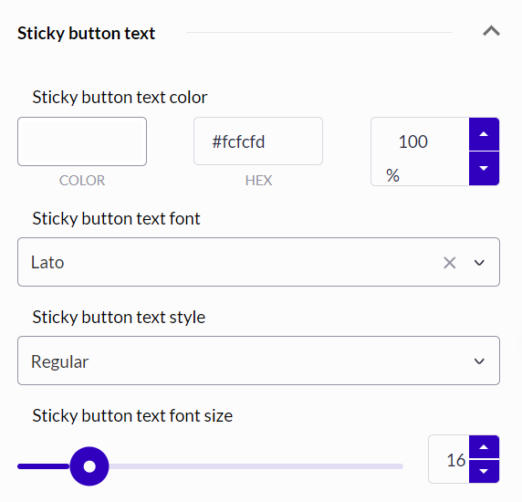
The configuration of the Sticky Button is quite similar to that of a button in other widgets. Colors, borders, and texts can be adjusted to the context of the site where the widget will be deployed.
### Style tab
Similarly, the style configuration allows adaptation for both the Sticky Button and the drawer itself.
The configuration of the Sticky Button is quite similar to that of a button in other widgets. Colors, borders, and texts can be adjusted to the context of the site where the widget will be deployed.
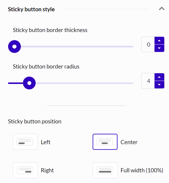
 Note that in the case of the Sticky Button, a position configuration is offered. This allows you to define the position of the tab in relation to the drawer itself: in the middle, at the top, at the bottom, or across the entire length of the drawer.
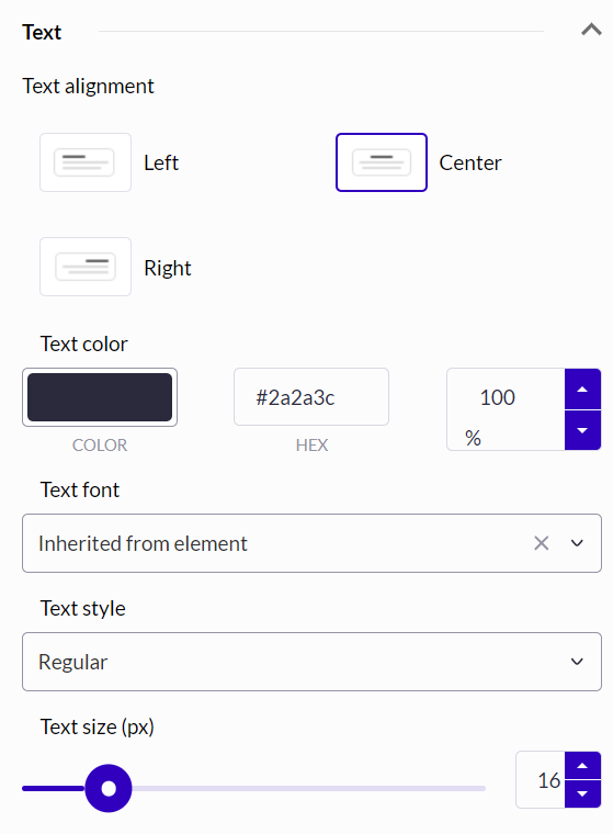
 For the container section, typical widget configurations can be performed: texts, colors, buttons, and borders can be adapted to the context of the site on which the widget will be deployed.
 ### Conditions tab
Finally, analogous to other widgets, the condition parameters allow you to define the conditions for appearance, recurrence, and the animation of the widget's appearance on the page.
---
# Agent Instructions
This documentation is published with GitBook. GitBook is the documentation platform designed so that both humans and AI agents can read, navigate, and reason over technical content effectively. Learn more at gitbook.com.
## Querying This Documentation
If you need additional information that is not directly available in this page, you can query the documentation dynamically by asking a question.
Perform an HTTP GET request on the current page URL with the `ask` query parameter, and the optional `goal` query parameter:
```
GET https://docs.abtasty.com/web-experimentation-and-personalization/editors-and-widget/list-of-widgets/ab-tasty-prebuilt-widgets/drawer-widget.md?ask=&goal=
```
`ask` is the immediate question: it should be specific, self-contained, and written in natural language.
`goal` is optional and describes the broader end goal you are ultimately trying to accomplish on behalf of the user. GitBook uses it to tailor the answer towards what is most useful for that goal.
The response will contain a direct answer to the question and relevant excerpts and sources from the documentation.
Use this mechanism when the answer is not explicitly present in the current page, you need clarification or additional context, or you want to retrieve related documentation sections.
### Conditions tab
Finally, analogous to other widgets, the condition parameters allow you to define the conditions for appearance, recurrence, and the animation of the widget's appearance on the page.
---
# Agent Instructions
This documentation is published with GitBook. GitBook is the documentation platform designed so that both humans and AI agents can read, navigate, and reason over technical content effectively. Learn more at gitbook.com.
## Querying This Documentation
If you need additional information that is not directly available in this page, you can query the documentation dynamically by asking a question.
Perform an HTTP GET request on the current page URL with the `ask` query parameter, and the optional `goal` query parameter:
```
GET https://docs.abtasty.com/web-experimentation-and-personalization/editors-and-widget/list-of-widgets/ab-tasty-prebuilt-widgets/drawer-widget.md?ask=&goal=
```
`ask` is the immediate question: it should be specific, self-contained, and written in natural language.
`goal` is optional and describes the broader end goal you are ultimately trying to accomplish on behalf of the user. GitBook uses it to tailor the answer towards what is most useful for that goal.
The response will contain a direct answer to the question and relevant excerpts and sources from the documentation.
Use this mechanism when the answer is not explicitly present in the current page, you need clarification or additional context, or you want to retrieve related documentation sections.